**The Dynamic Island Is Not Very Dynamic. Certainly an Island, Though!**
*This article may contain personal views and opinions from the author.*
Contrary to what my favorite haters might say, I haven’t been actively using an iPhone since the iPhone 13 era. This means I missed out on the Dynamic Island innovations that came with the iPhone 14 Pro.
Yes, I know what it does. Yes, I’ve reviewed a couple of iPhone models since then. But nothing compares to taking it on as my only carry and using it as my main phone.
Over this past month, I’ve put my SIM card into the ol’ iPhone 16 Pro Max, tempted by that Liquid Glass software and the last-of-a-kind titanium body. And I’ve discovered something: I kind of hate the Dynamic Island.
—
### The Widget Operation Is Backwards
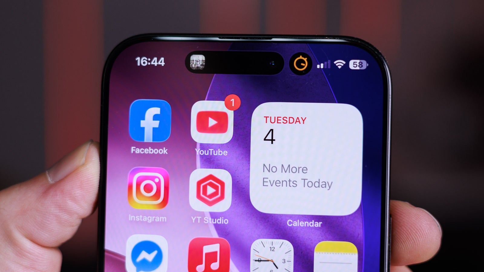
On the surface, the Dynamic Island is a pretty nice idea. It adds some form of multitasking to the iPhone — something the device has lacked for years. You can have various “active” widgets up there, appearing as tiny icons next to the selfie camera and Face ID sensors.
So, when you have music playing, the Dynamic Island shows a little audio wave. You can tap and hold on it to get a bigger widget for multimedia controls.
But if you tap it once, the iPhone immediately drops what you are doing and swaps to the fullscreen music app that is active.
Wait, what?
The entire point of the Dynamic Island, I thought, was to make things quick and easy. In my mind, the floating widget should appear with just a single tap. A tap and hold — the slower gesture — should be the action that takes you to the big app.
Not the other way around.
Why am I given quick access to controls, but only if I hold my finger on the screen?
—
### I Am Playing “Don’t Whack the Dynamic Island” with My Thumb
iOS has a lovely feature: whenever you are viewing a long website or document, you can tap at the very top of the screen for an instant “return to top” function. I’ve used this for years and it’s pretty convenient, to the point of being second nature.
Well, not so much now.
If I have an active widget going on the Dynamic Island, I have to take care not to tap it. Because not only will I not return to the top, I will swap to a whole different app — due to the functionality described above.
—
### I Don’t Like Smudging Up My Selfie Camera
We can all agree that it’s pretty silly to have an interface element placed on the one spot of the screen you don’t want to be touching.
Yes, you can wipe it away easily, but that doesn’t mean I enjoy constantly having fingerprints on my selfie camera lens.
Technically, the Dynamic Island is a bit wider than the entire Face ID cutout, so you can tap at its corners or go super-precise and tap between the selfie camera and the IR blaster.
But let’s be real — sometimes or often enough, that finger lands exactly on the selfie camera lens. Awesome.
—
### Samsung Copied It, Right
Samsung introduced the Now Bar with One UI 7 this year, and it is a pretty obvious riff on the Dynamic Island.
But here’s how it’s better:
– On the lock screen or always-on display, the Now Bar actually moves to the bottom of the display. This makes it easier to thumb-tap or swipe when you’re just taking your phone out of your pocket and holding it with one hand for at-a-glance information.
– When the screen is unlocked, the Now Bar sits in the top left corner of the screen — not over the selfie camera.
– Simply tapping the Now Bar once expands the active widget behind it, making it faster and easier to access.
– Tapping that widget again actually opens the entire app. It’s much more deliberate and logical.
—
### Is There Hope That Apple Would Redo It?
Apple hates changing user experience elements. It doesn’t want to create any friction with new OS experiences, which is why we still have old and silly features like “shake the phone for Undo,” even though you can now do it by triple-finger tapping on the screen instead.
So, my hopes for the way the Dynamic Island operates are very, very low.
It is what it is, and definitely not an experience-breaking thing.
It just baffles me that it was designed this way in the first place.
Otherwise, the idea behind it — to add some quick-tap multitasking to the iPhone — was sorely needed and is much appreciated.
—
*Iconic Phones is now up for pre-order in the US! Pre-order now and save 15% with code: PARENA15*
—
**Recommended Stories**
– FCC OKs Cingular’s purchase of AT&T Wireless
– Follow us on [Google News](#)
—
*Subscribe to receive the latest editorials. By subscribing, you agree to our terms and conditions and privacy policy.*
https://www.phonearena.com/news/Why-I-hate-the-iPhone-Dynamic-Island_id175464